Recently I was working on an iOS app where I had to use a UICollectionView to display “cards” with some content. Similar to the cards in Material Design (aka the CardView) which you see everywhere in Android. Since the content of my cards can be different at runtime, I needed a way to make the cells always shrink to their minimum size (given a known width) so I didn’t end up with ugly empty white spaces on my cards. At first I wasn’t quiet sure how to let the cells of the UICollectionView handle their own size but this is what I came up with and I think it works pretty well.
Caution: This is not a complete step by step tutorial for iOS beginners. It’s more of a concept on how you could handle things. It might or might not fit your personal needs so don’t just copy paste the code you find here.
What we need to start
To start, we first need the usual candidates:
- UICollectionView
- UICollectionViewCell
- UICollectionViewLayout
A quick reminder / introduction to everybody new to UICollectionView. They are very similar to the well known UITableView but instead of only displaying a horizontal or vertical list where each item comes after another, UICollectionViews are a lot more flexible, when it comes to styling.
This is, because the UICollectionView has something, which the tableview doesn’t: UICollectionViewLayout. Basically, the UICollectionView is the container which contains all the other views (for example cells but also supplementary views like section headers or a background). Cells and other views contain the actual content but the big deal is the UICollectionViewLayout, which is responsible for calculating where each view should appear in the UICollectionView and what dimensions it shall use.
By subclassing the often used UICollectionViewFlowLayout or the generic UICollectionViewLayout, you can layout the subviews of the UICollectionView however you like. For example as a “stack” of items, where cells overlap each other. Or as a ring of views or a carousel or slider. You can come up with whatever layout you can imagine.
The self-sizing UICollectionViewCell
Okay, now let’s get to coding. For my project, I had a UICollectionViewCell with an UIImageView as well as some UILabels. Unfortunately, I didn’t know how long the text for the labels would be at runtime, since it was loaded from a web service. Not knowing how big some views are at runtime is probably the most common reason to use self sizing UICollectionViewCell.
Fortunately, it is a lot easier, than you might think. First, lets sketch what we want to achieve. In my case, my UICollectionViewCell looks like this:
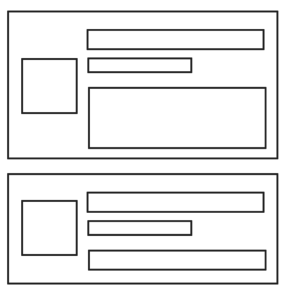
As you see, there is the image on the left followed by 3 labels which are dynamic in height depending on how many text there will be. So lets start by creating a new UICollectionViewCell by selecting File > New > File > Cocoa Touch Class and selecting UICollectionViewCell as the super class. Also check the create XIB checkbox if you, like I, want to separate the cells layout from the rest of your interface for better reusability. Now add your UI. Mine looks like this:
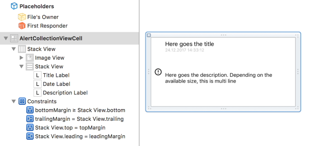
As you can see, I make use of the powerful UIStackView instead of setting up tens of constraints. Basically, this is all I had to do:
- The 3 UILabels go into a vertical UIStackView
- The UIImageView and the UIStackView go into a horizontal UIStackView
- The UIImageView has constraints on it’s width (40) and aspect ratio (1:1)
- The top level UIStackView is set to align center so the image is always centered vertically
- The top level UIStackView was pinned to the superview
- Notice: The bottom layout constraint is set to >= instead of just =. If you don’t set it to greater or equals, the UIStackView will strech the label with the lowest hugging priority
You might need to tweak the hugging and resistance properties of your views to get rid of any errors. Good. Now to the next step. The layout.
Create another class which is a subclass of UICollectionViewLayout and implement your layout. Mine should look like a grid where depending on the device and screen orientation, it has more or les columns. I probably could have used a UICollectionViewFlowLayout but I also wanted to get a better understanding of the anatomy of UICollectionViewLayout since it has been a while since I used collection views for the last time. So I went with the basic UICollectionViewLayout instead and did everything myself.
It’s actually not too hard. Have a look at this code. I’ll explain it below:
import UIKit

protocol OwnerMainScreenLayoutDelegate {
  // Get the height of a given alert or status card depending on it's width (e. g. a card could have more or less rows of text.
  func collectionView(collectionView: UICollectionView, heightForItemAtIndexPath indexPath: IndexPath, withWidth: CGFloat) -> CGFloat
}

class OwnerMainScreenLayout: UICollectionViewLayout {

  //Delegate to get the height for our items from
  var delegate: OwnerMainScreenLayoutDelegate!

  //Number of columns varies depending on device and orientation
  var numberOfColumns: Int {
    if UIDevice.current.orientation.isPortrait {
      switch UIDevice.current.userInterfaceIdiom {
      case .pad:
        return 2
      default:
        return 1
      }
    } else {
      switch UIDevice.current.userInterfaceIdiom {
      case .pad:
        return 3
      case .phone:
        return 2
      default:
        return 1
      }
    }
  }

  //Padding between cells
  var cellPadding: CGFloat = 6.0

  //Cache for the layout attributes
  private var cache = [[UICollectionViewLayoutAttributes]]()

  //Conent size
  private var contentHeight: CGFloat = 0.0
  private var contentWidth: CGFloat {
    let insets = collectionView!.contentInset
    return collectionView!.bounds.width - (insets.left + insets.right)
  }

  override func prepare() {

    // Check if cache is empty and calculate attributes if so.
    if cache.isEmpty {

      // Calcluate the width of each column and store starting position for each column
      let columnWidth = contentWidth / CGFloat(numberOfColumns)
      var xOffset = [CGFloat]()
      for column in 0 ..< numberOfColumns {
        xOffset.append(CGFloat(column) * columnWidth )
      }

      //Store starting y positions
      var yOffset = [CGFloat](repeating: 0, count: numberOfColumns)

      //Calculate attributes for each item
      for section in 0..<collectionView!.numberOfSections {
        //Start each section with column 0
        var column = 0
        //Create a cache for each section to add to the overall cache
        var sectionCache = [UICollectionViewLayoutAttributes]()
        //Calculate start height for this section
        if section > 0, let max = yOffset.max() {
          yOffset = [CGFloat](repeating: max, count: numberOfColumns)
        }

        //Calculate position for each item
        for item in 0..<collectionView!.numberOfItems(inSection: section) {
          //Calculate the frame for the item
          let indexPath = IndexPath(item: item, section: section)
          let width = columnWidth - cellPadding * 2
          let itemHeight = delegate.collectionView(collectionView: collectionView!, heightForItemAtIndexPath: indexPath, withWidth: width)
          let height = cellPadding + itemHeight + cellPadding
          let frame = CGRect(x: xOffset[column], y: yOffset[column], width: columnWidth, height: height)
          let insetFrame = frame.insetBy(dx: cellPadding, dy: cellPadding)

          //Create the layout attributes
          let attributes = UICollectionViewLayoutAttributes(forCellWith: indexPath)
          attributes.frame = insetFrame sectionCache.append(attributes)

          // Increase the row height for the next iteration
          contentHeight = max(contentHeight, frame.maxY)
          yOffset[column] = yOffset[column] + height

          //Continue with next column or reset column to 0 when max is reached
          column = column >= (numberOfColumns - 1) ? 0 : 1 + column
        }
        cache.append(sectionCache)
      }
    }
  }

  override var collectionViewContentSize: CGSize {

    //Return the size of the content. In our case, its the same width as the screen and as height as necessary
    return CGSize(width: contentWidth, height: contentHeight)
  }

  override func layoutAttributesForElements(in rect: CGRect) -> [UICollectionViewLayoutAttributes]? {

    //The attributes we will return
    var layoutAttributes = [UICollectionViewLayoutAttributes]()

    //Check each attribute in the cache if it is in the rect
    for section in cache {
      for attributes in section {
        if attributes.frame.intersects(rect) {
          layoutAttributes.append(attributes)
        }
      }
    }

    //Return the attributes which are inside the rect
    return layoutAttributes
  }

}
The first thing to notice is the OwnerMainScreenLayoutDelegate. I use this delegate later to ask the cell for it’s hight while providing it with a width. The next step is the prepare function. Here I simply calculate the frame for each cell. I do this by calculating the width for each column (depending on the amount of columns) and then letting the delegate return the proper height. I than set the x and y position of each frame by calculating in which column it should be displayed and the height of the previous frames in this column.
I do this for each column of each section of the collection view and will end up with something very similar to the UICollectionViewFlowLayout but still slightly different. It’s more like the Pinterest waterfall which restarts with a clean cut for each section. The last two steps are to return the calculated content size and return the correct layout attributes for the cells when we are asked for them.
With the layout in place, it’s time to use it. If you are using StoryBoards, you can select the layout class there. Otherwise set it programmatically. You know the drill. Make sure that you somewhere implement the delegate protocol.
Now comes the tricky part. To let the cell decide it’s own height, we need a dummy cell which we can use for measuring. I do this where I register my custom cells as well:
func registerCollectionViewCells() {
  //Register cells
  collectionView?.register(UINib(nibName: "AlertCollectionViewCell", bundle: nil), forCellWithReuseIdentifier: kCellReuseIdentifier)

  //Setup sizing cells (dummy cells used to calculate sizes)
  let sizingAlertNib = Bundle.main.loadNibNamed("AlertCollectionViewCell", owner: AlertCollectionViewCell.self, options: nil)
  sizingAlertCell = sizingAlertNib?[0] as? AlertCollectionViewCell
}
Do you see what I mean? I instantiate one of the cells programmatically and store it for later use. Now when the layout calls my view controller and asks for the height of the cell, I can use my sizing cell to calculate the height. I do this by calling a custom method heightFor(width) which I will show you in a second. But first, heres my implementation of the delegate in my view controller:
extension OwnerMainScreenCollectionViewController : OwnerMainScreenLayoutDelegate {
func collectionView(collectionView: UICollectionView, heightForItemAtIndexPath indexPath: IndexPath, withWidth: CGFloat) -&amp;gt; CGFloat {
sizingAlertCell?.set(alert: device?.alerts?[indexPath.row])
return sizingAlertCell?.heightFor(width: withWidth) ?? 200
}
}
Here is the aforementioned heightFor(width).
func heightFor(width: CGFloat) -> CGFloat {
  //Set new frame size
  var frame = self.frame
  frame.size = CGSize(width: width, height: CGFloat.greatestFiniteMagnitude)
  self.frame = frame

  //Let AutoLayout calculate frames
  self.setNeedsLayout()
  self.layoutIfNeeded()

  //Height is bottom of description label + margins
  return contentView.layoutMargins.top + stackView.frame.size.height + contentView.layoutMargins.bottom
}
As you see, I first change the frame of my measuring cell to fit the provided width. I also make it as height as possible. Then I let AutoLayout do it’s magic. Thanks to the constraints I have setup for the UIStackView, especially the >= bottom, the UIStackView will use the full width and then expand as much to the bottom as it needs.
Finally I can simply get the height of the UIStackView, add the top and bottom layout margins (I pinned the UIStackView to the margins) and return it. This gives me the exact height the cell must be to fit all its content without truncating any labels. It works like a charm and for now I haven’t noticed any performance issues. To be fair, I only have around 20 cells in my collection view at the moment but anyways, thats it for today.
tl;dr;
Okay so lets sum up what we need to get self-sizing UICollectionViewCells:
- We need a cell with proper AutoLayout constraints
- We need a layout which will ask us what size we want to use (could probably be a UICollectionViewFlowLayout)
- We need to create an instance of our cell which we can use for measuring
- When asked for the dimensions of the cell, we need to retrieve the model object for the IndexPath and hand it down to the cell
- We then need to set the cells frame to be something really big and let AutoLayout calculate all the frames
- We finally can get the calculated frames from our UI components and return it to the layout.
What do you think? Did I forgot something important or is there even a better way to get the minimum size of the cell at runtime? Let me know in the comments.
Trackbacks/Pingbacks