This post is for all the affiliate marketers out there who want to create awesome, beautiful niche sites. To be more precise, to those who use the Affiliatetheme.io WordPress theme. In this post you will learn, how to create a cool looking navigation bar which looks like it is hugging the content. Just like this one:
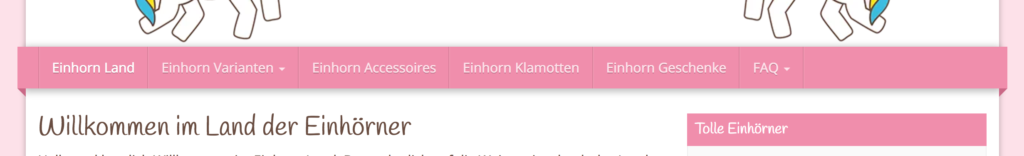
As you see, it looks like the menu extends over the content boxed layout. It also seems to hover over the content and is hugging it. I borrowed the image above from Einhornland, a german niche site all about unicorns. To achieve a look like this, all we need to do is tweak the CSS a little bit.
Affiliatetheme.io
But before we start, let me introduce you to the Affiliatetheme.io. If you already know it, feel free to skip this section. But for those stumbling about this post by accident, thats something you want to know about, trust me.
The Affiliatetheme is a genuine WordPress Theme targeted especially for affiliate marketers like you. It comes with API interfaces for a lot of platforms like Amazon, Affilinet, Zanox, Belboon, eBay and Adcell.
Also it has some really neat features like product filters, comparison tables and even the possibility to setup a fake shop. You can however also import products or create your own ones and link them to detail pages. It has dozens of possibilities to showcase your products and is fully stylable and customizable. You should definitely check it out.
How to make the Affiliatetheme.io Navigation Bar Hover
Okay, enough advertising. Let’s get back to business. To achieve our goal of extending the navigation bar and make it “hug” the content below, we need to do a few things:
- Add a shadow below the bar so that it looks like it is hovering
- Extend the bar to the left and the right
- Add a little triangle to each side so it looks like it folds back behind the content
The first step is easy enough. Lets add a shadow to the main navigation element:
[code lang=”CSS”]
#navigation .navbar {
box-shadow: -10px 0 0 #F08EAC, 10px 0 0 #F08EAC, 0 2px 12px 2px rgba(0, 0, 0, 0.25);
z-index: 99;
}
[/code]
Replace #F08EAC with the color of your own navigation background and add the css to your page. Do you see that? We hit two flies with one stroke. We actually added two shadows. A colored one which extends 10 pixels to the left and the right and a dark one below the bar.
The next step is to add the triangles wo make it look like the navigation is folding back.
[code lang=”CSS”]
#navigation .navbar:before, #navigation .navbar:after {
bottom: -10px;
position: absolute;
width: 0;
height: 0;
border-style: solid;
border-color: transparent;
}
#navigation .navbar:before {
left: -10px;
border-width: 0 10px 10px 0;
border-right-color: #F08EAC;
}
#navigation .navbar:after {
right: -10px;
border-width: 10px 10px 0 0;
border-top-color: #F08EAC;
}
[/code]
Here we use some crazy CSS tricks to create triangles using empty content in the before and after pseudo element of the navigation. We only write the common style once and use the single styles to position the elements correctly.
Make sure to change the color and to make it really look like there is a banderole which folds back, make the color a little bit darker than the navigation color. Thats it. Isn’t that easy? Well I guess you have to know a few little CSS tricks to come up with something like this.