Equalizing the heights of multiple blurbs in one row requires some CSS hacking. Fortunately, Material Blurb for Divi has custom CSS fields for every element, so you don’t need to touch your themes or pages CSS. Everything can be done directly in the module. So heres how you can equalize the height:
The first step is to activate the Equalize Column Heights setting of the Page Builder Row which will contain your Material Blurbs. Then switch to the advanced tab of the Row Module Settings and add display: flex; to each Column Main Element. 

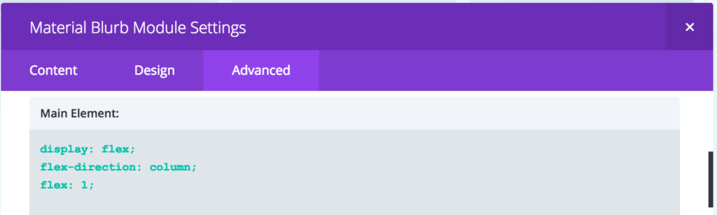
The second step is to make the Material Blurbs use flexes as well. First add display: flex; flex-direction: column; flex: 1; to the main element. This will already cause the blurbs to fill the available space. However, the text as well as the buttons are still only filling as much space as they need, causing the blurbs with less content to have empty space at the bottom.

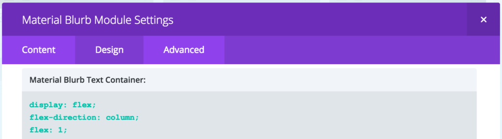
It is now up to you how you want your blurbs to look like. If you want the button to be positioned at the bottom of the blurb, you can add display: flex; flex-direction: column; flex: 1; to the Material Blurb Container, Material Blurb Text Container and Material Blurb Text Content as well as flex: 1; to Material Blurb Text Body.


Another styling option we like is centering the text and button. You can achieve that by adding display: flex; flex-direction: column; flex: 1; to the Material Blurb Container as well as display: flex; flex-direction: column; flex: 1; justify-content: center; to the Material Blurb Text Container.


CSS flex property is very powerful and we thought the elements of Material Blurb for Divi very well through so you have a lot of freedom. To learn more about the possibilities, we recommend these tutorials:
- https://css-tricks.com/snippets/css/a-guide-to-flexbox/
- https://scotch.io/tutorials/a-visual-guide-to-css3-flexbox-properties
- https://www.w3schools.com/css/css3_flexbox.asp
Recent Comments